


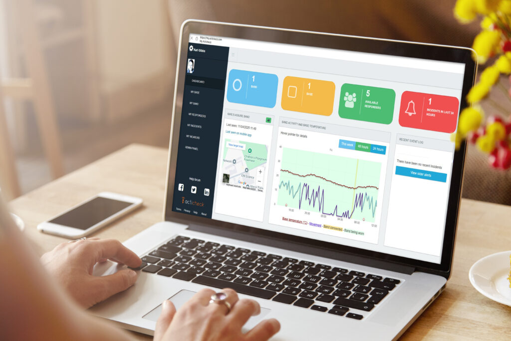
If you’ve ever logged into MyActicheck and looked at the Wearer’s Dashboard, you will have seen their chart. But do you know what it all means and how it works?
The standard information you will see includes:
Other data received includes:
If you visit MY BAND you will also see the ‘Golden Line’, but more on that below the picture.
The example below shows what each line represents on a wearer’s chart (although we can see more information here).
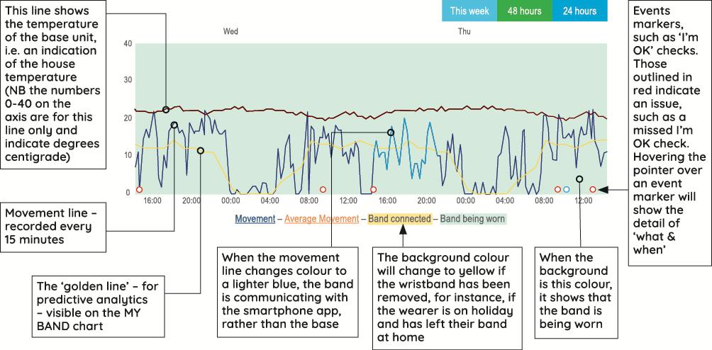
You can view the past 24 hours’, 48 hours’ or past week’s data for movement, base connectivity and temperature, wristband connectivity and smartphone app connection (there’s also a bar chart showing the past month’s activity).
The general pattern of activity levels are reasonably consistent and give us a baseline, which we call the ‘Golden Line’, to compare against the last 24 hours of activity.
Our Predictive Analytics function uses this historical data to indicate that something may happen in the future. In terms of wellbeing, this can indicate a possible health problem, such as a UTI if the Wearer has ‘had a restless night’.
If our analysis finds a significant discrepancy between the recent activity and the golden line, we will notify the Wearer and anyone with Administrator status in an email.
Emails are turned off by default – to enable emails to the band Wearer go to MY BAND and toggle the switch.
Responders can enable/disable these emails on the MY WEARERS screen.

We should stress, however, that a notification doesn’t necessarily mean that anything is wrong.